AI Insights 365 · End-user guide
From signing in to a report people actually read.
Nine steps, in the order you will meet them, with a picture of every screen. You do not need SQL, and you do not need to know which chart to pick — the product proposes both.
Sign in
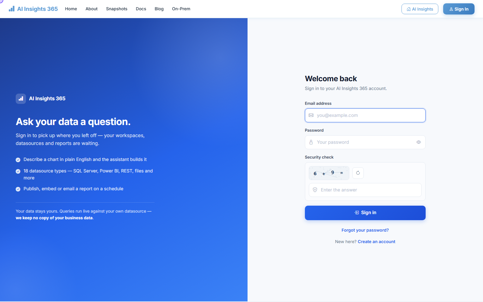
▶ Watch this step: Get started (1:33)Go to aiinsights365.net and sign in with the email your organisation was set up with. The arithmetic question below the password keeps automated sign-in attempts out; answer it and continue.
- No account yet? Create one — name, organisation, country, work email and a password. Your first report costs nothing and no card is needed.
- Forgotten your password? Use Forgot your password? and follow the emailed link.
- Your organisation name is set once, at sign-up, and cannot be changed afterwards — use the real one.
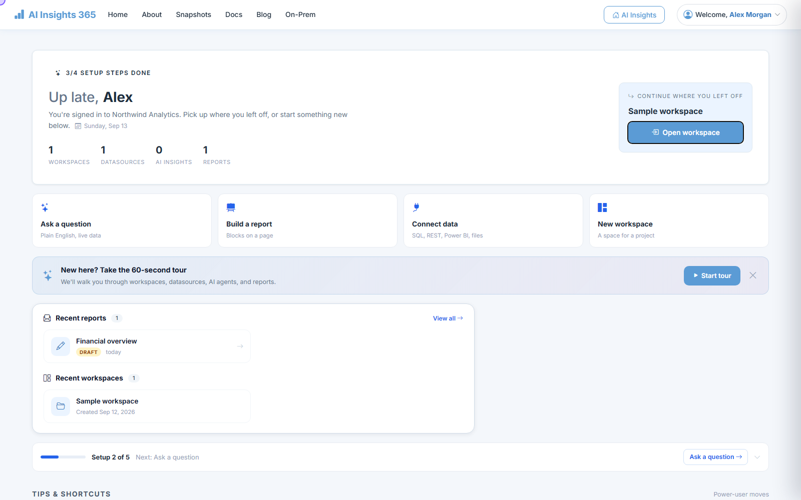
Once you are in, you land on a screen that shows what you were last working on and four ways to start something new: Ask a question, Build a report, Connect data and New workspace. If you are new, the 60-second tour walks you round.
Find your way around a workspace
▶ Watch this step: Get started (1:33)A workspace is one project's worth of work: the data it uses, and the reports built from it. Most people spend all their time inside one.
The strip across the middle is the lineage — it reads left to right, from the data, through where it is shaped, to the report. When somebody asks six months from now where a number came from, this is the answer.
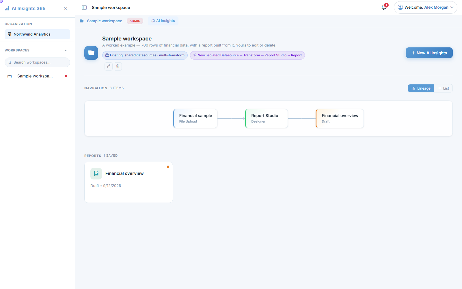
Switch between Lineage and List in the top right. Lineage is for understanding how things connect; List is for finding something fast.
Connect your data
Choose Connect data, pick what kind of data it is, name it, and give it whatever it needs to sign in. Then Test & Load Fields — the table list appears within seconds, and you are done.
| If your data is… | Pick |
|---|---|
| A spreadsheet on your machine | File Upload — the most common way to start |
| A file on a public link | Public File URL |
| A company database | SQL Server, PostgreSQL, MySQL, SQLite, Oracle Cloud or MongoDB Atlas |
| A data warehouse | Snowflake, BigQuery, Redshift, Databricks or AWS Athena |
| A business system | Salesforce, HubSpot, Dynamics 365 or Google Analytics 4 |
| Somewhere else entirely | REST API, Power BI, Google Sheets, Dropbox or OneDrive |
Data that must not leave your building. Turn on Route via Gateway and pick your organisation's gateway. Questions still run against your database, but the database itself is never exposed to the internet. Your administrator sets this up once.
Shape it, if it needs shaping
▶ Watch this step: Shape your data (1:29)Real data is rarely in the shape you want to chart. Transform is where you fix that — filter out the rows you do not want, rename a column, combine two sources, add a calculation.
Each change is a numbered step you can see, reorder and undo. That matters more than it sounds: the next person to open this can read exactly what you did, which is not true of a formula buried in a spreadsheet cell.
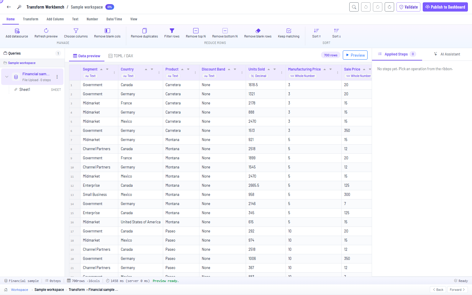
- Prefer typing? The Pipeline script tab shows the same steps written out, and you can edit them there.
- The assistant on the right can do it for you — add a column for margin, drop the rows with no country.
- You can skip this step entirely. Plenty of reports are built straight off the data as it arrives.
Ask a question in plain English
▶ Watch this step: Ask a question (1:22)Type the question you would have asked a colleague. The assistant reads your data, works out the answer, draws it if a picture helps, and explains what it did.
- "How many customers signed up last month?"
- "Top 5 products by revenue this quarter"
- "Compare daily active users this week against last week"
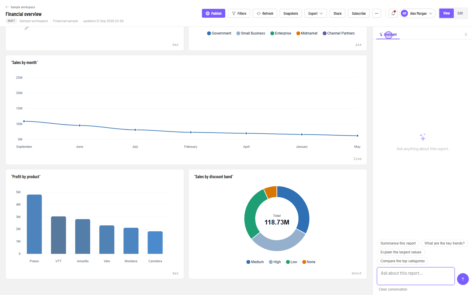
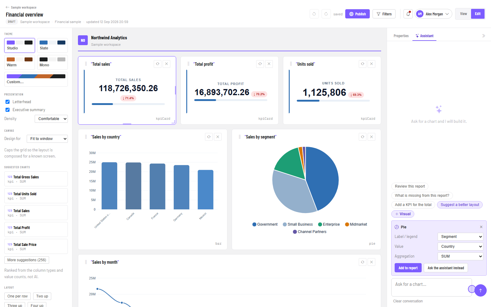
Opened from a report, the assistant can see what is on the page — so summarise this report comes back with your real numbers, not a description of the layout. Suggested questions sit above the box if you would rather click than type.
If an answer looks wrong, say so. Tell it what you expected. It works from the data it has, and it will tell you when your data cannot answer something rather than inventing a figure.
Build a report
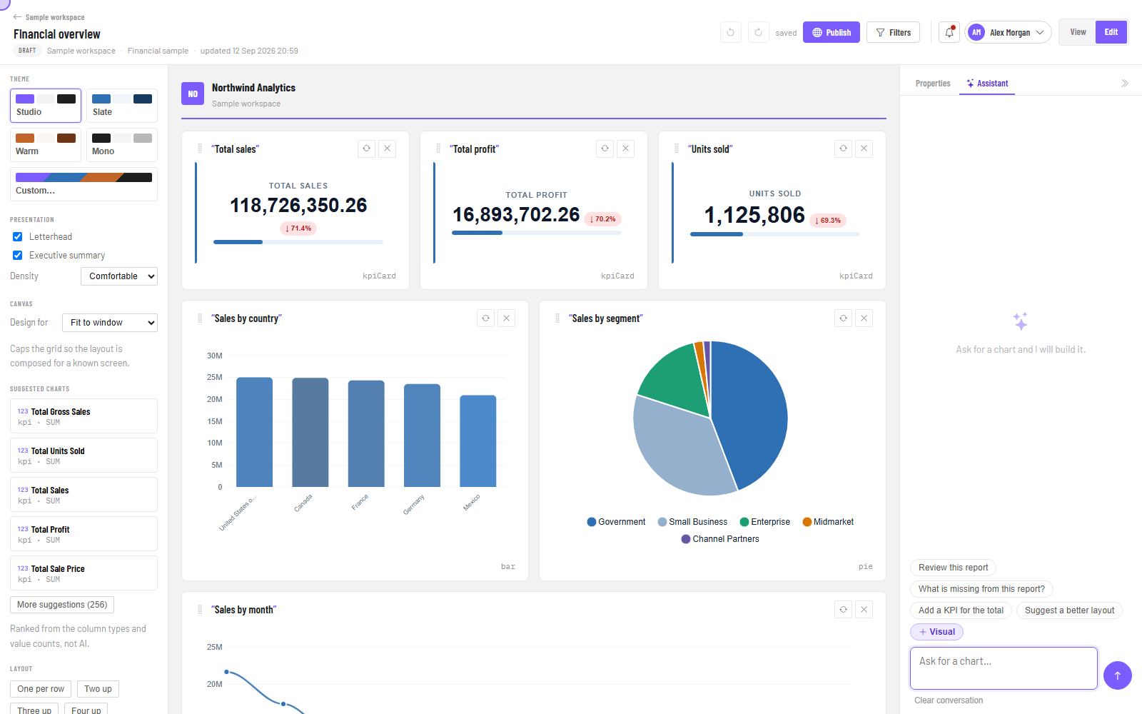
▶ Watch this step: Build a report (1:38)Open a report and switch to Edit with the toggle at the top right. Nothing moves when you switch — it is the same page, with the tools shown. If the toggle is not there, you have viewing rights only; ask a workspace admin.
Three ways to add something
- Suggested charts — the left panel ranks visuals from your own columns. Each names the fields it would use. Click one and it appears, already built.
- Ask for it — tell the assistant show revenue by month and it picks the fields and the visual for you.
- Auto Report — writes the whole page in seconds: title, headline numbers, charts and tables. Keep it, or treat it as a first draft.
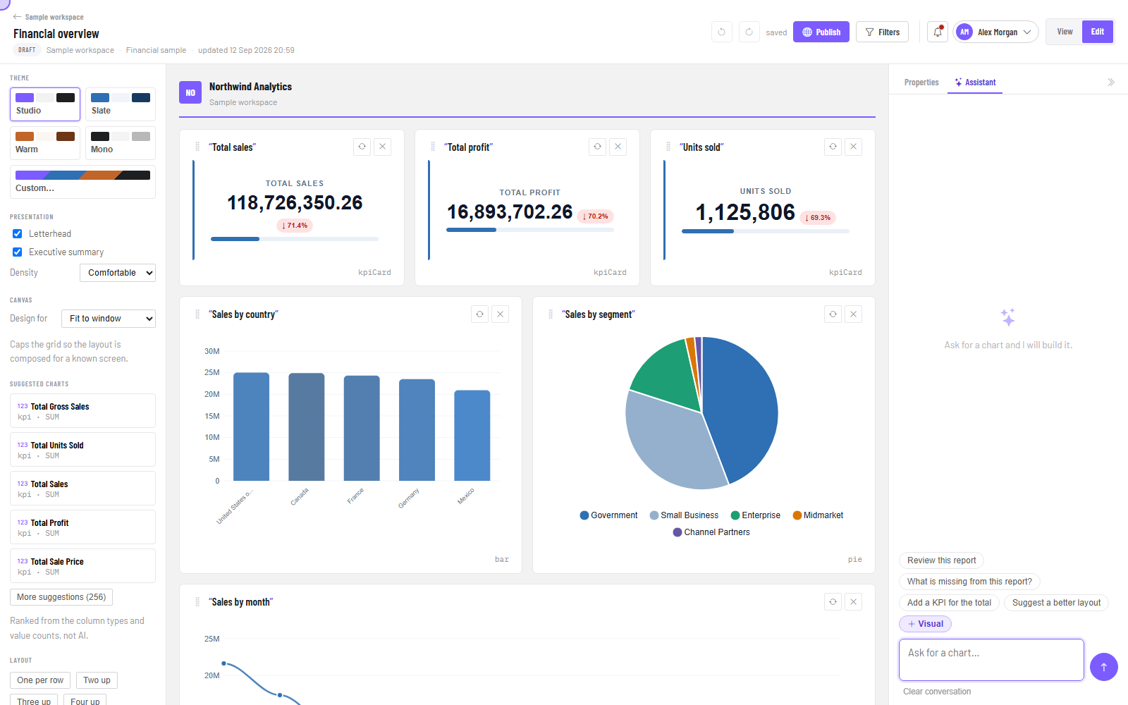
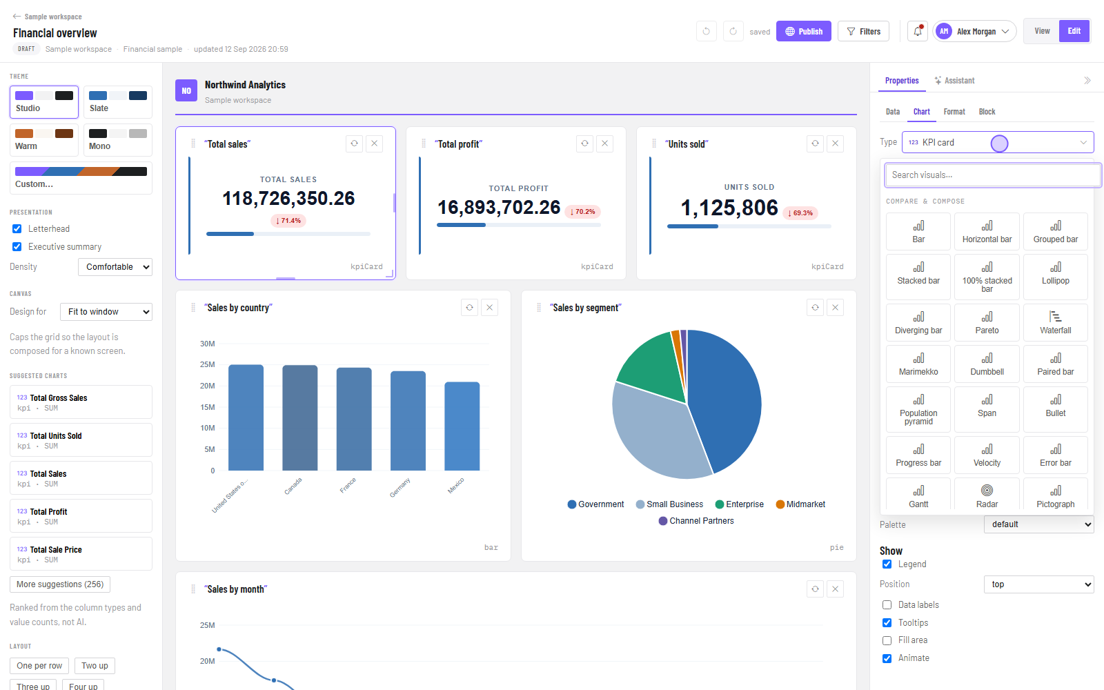
Adding one yourself is two decisions: press + Visual, choose the shape, then choose which columns go where. Nothing to write, and nothing to wait for.
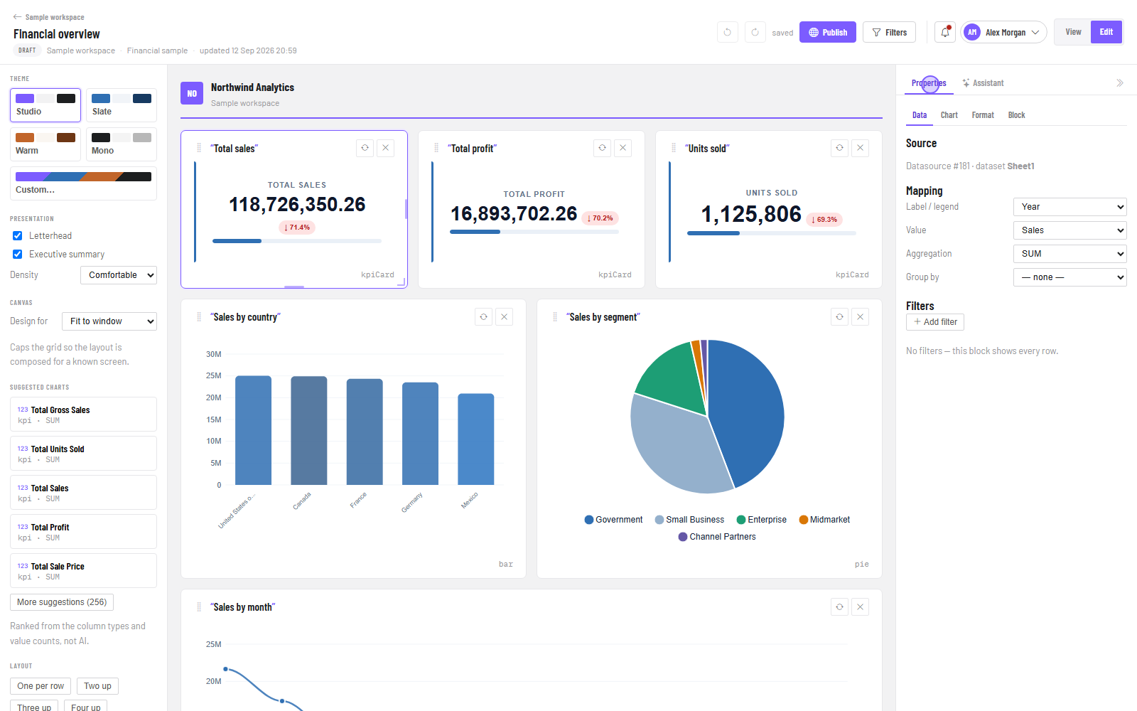
| Tab | What you change there |
|---|---|
| Data | Which fields go where, grouping, totals, row limit |
| Chart | The visual type — swap a bar for a line without rebuilding |
| Format | Colours, labels, legend, number formatting |
| Block | Width, height and position on the page |
Your work saves itself. When the header says saved, it is safe to close the tab. Publish is separate and deliberate — until you publish, only people with access to the workspace can open it.
Read a report
▶ Watch this step: Read and share (1:17)Headline numbers across the top, then the charts that explain them. This is what your audience sees.
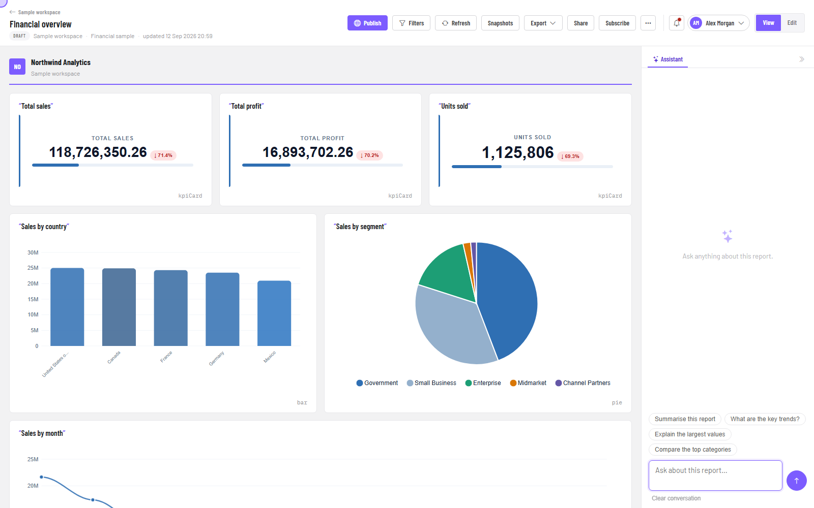
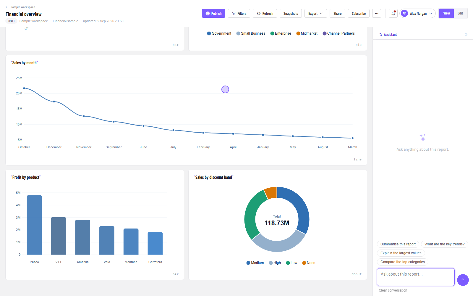
- Filters set the scope before you read — a region, a product, a date range.
- Click a bar or a slice and everything else on the page narrows to match. Click again to clear.
- Refresh pulls the latest figures without reloading the page.
- Snapshots are frozen copies as the report stood on a date, so you can compare this month with last.
- Export gives you PDF, PowerPoint, CSV or a Power BI project.
People, licences and billing
▶ Watch this step: People and licences (1:14)If you run the organisation, Settings is where you add colleagues, assign licences and manage what you pay. Everyone else can skip this step.
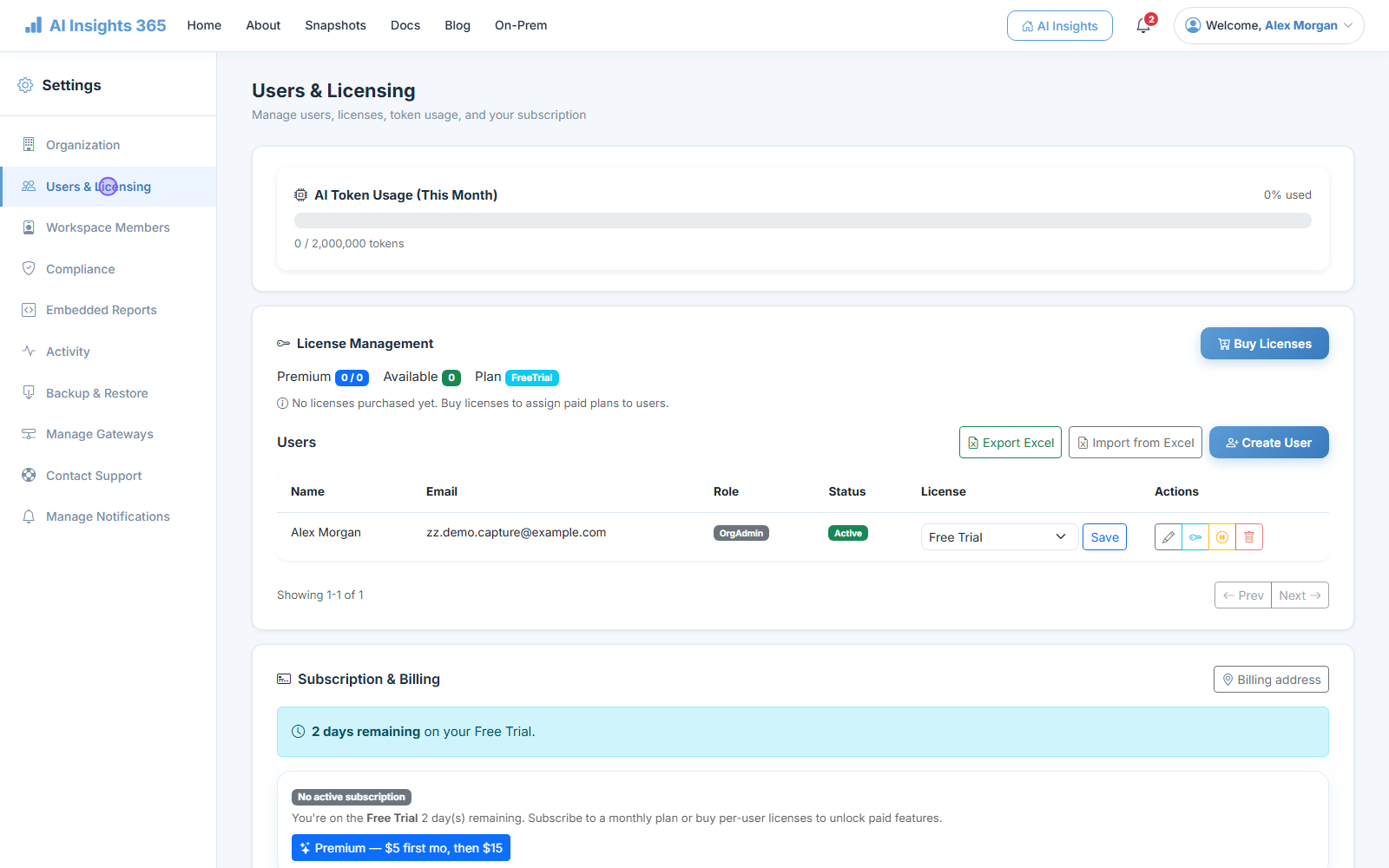
- Buy licences, then assign one to each person. When somebody leaves, reassign theirs.
- Import from Excel is the quick way to add more than a handful of people at once.
- Access has two layers: what someone can do to the organisation, and what they can do in each workspace — Viewer, Editor or Admin, set per workspace.
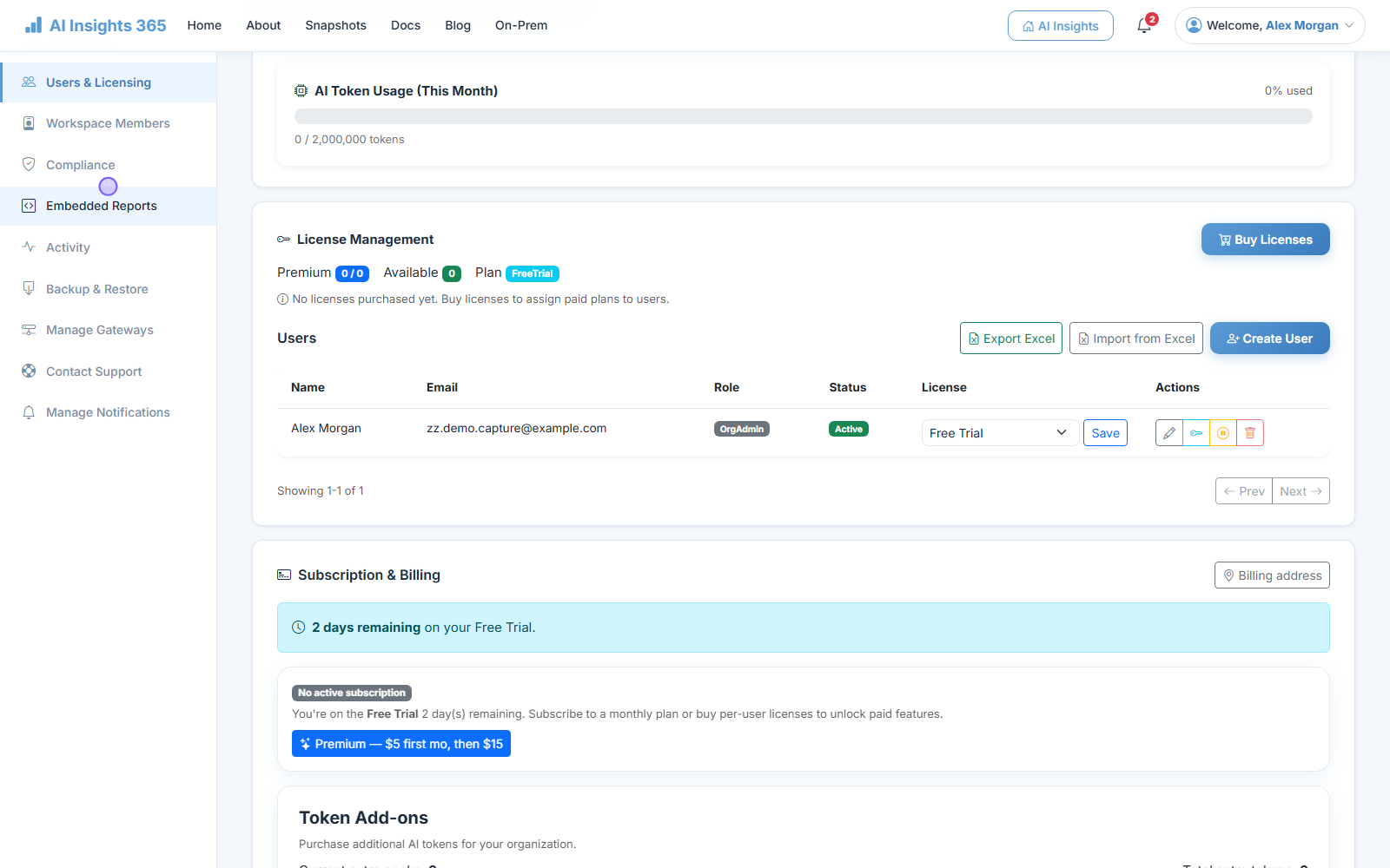
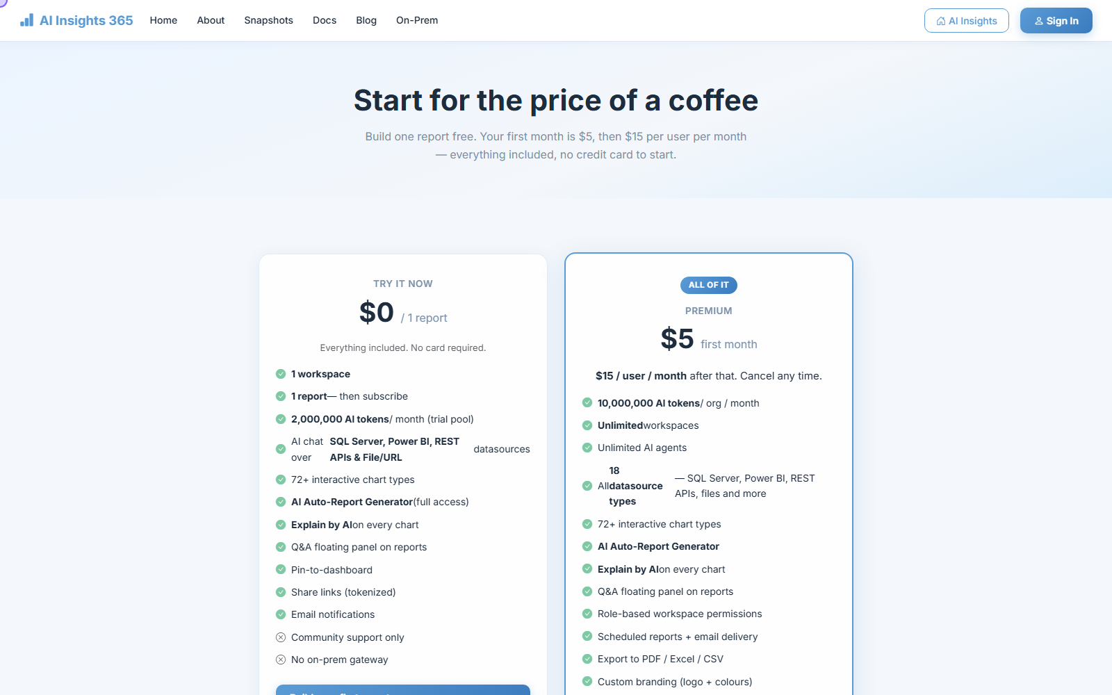
Everything is in Premium. There is no feature tier to compare — the assistant, Auto Report, scheduling, embedding and the gateway are all included, and you can cancel at any time.
Common questions
Do I need to know SQL?
No. Ask in plain English. If you can read a query you are welcome to look at the one behind any chart, but nothing asks you to write one.
Where does my data live? Do you keep a copy?
Questions run live against your own datasource. Files you upload are stored encrypted; for a database or an API the connection is used to answer the question, not to take a second copy of your data. If even that is too much, the whole platform can run inside your own network.
The View / Edit toggle is missing. Why?
You are a Viewer in that workspace. Ask a workspace admin for Editor access. Being an Editor in one workspace does not carry over to another.
Can I undo something?
Yes — Undo and redo are in the report header, or Ctrl+Z and Ctrl+Y. Your work also saves as you go, and publishing is a separate, deliberate step.
How do I get my report into PowerPoint or a PDF?
Export, in the report header. PDF comes out paginated and branded, PowerPoint gives you one slide per block, and CSV gives you the underlying rows.
Something is wrong, or I am stuck.
Write to support@aiinsights365.net, or use Contact Support in Settings, which sends us the details of what you were doing at the time.